A silver gelatin dry plate glass negative in landscape format.

Country Always

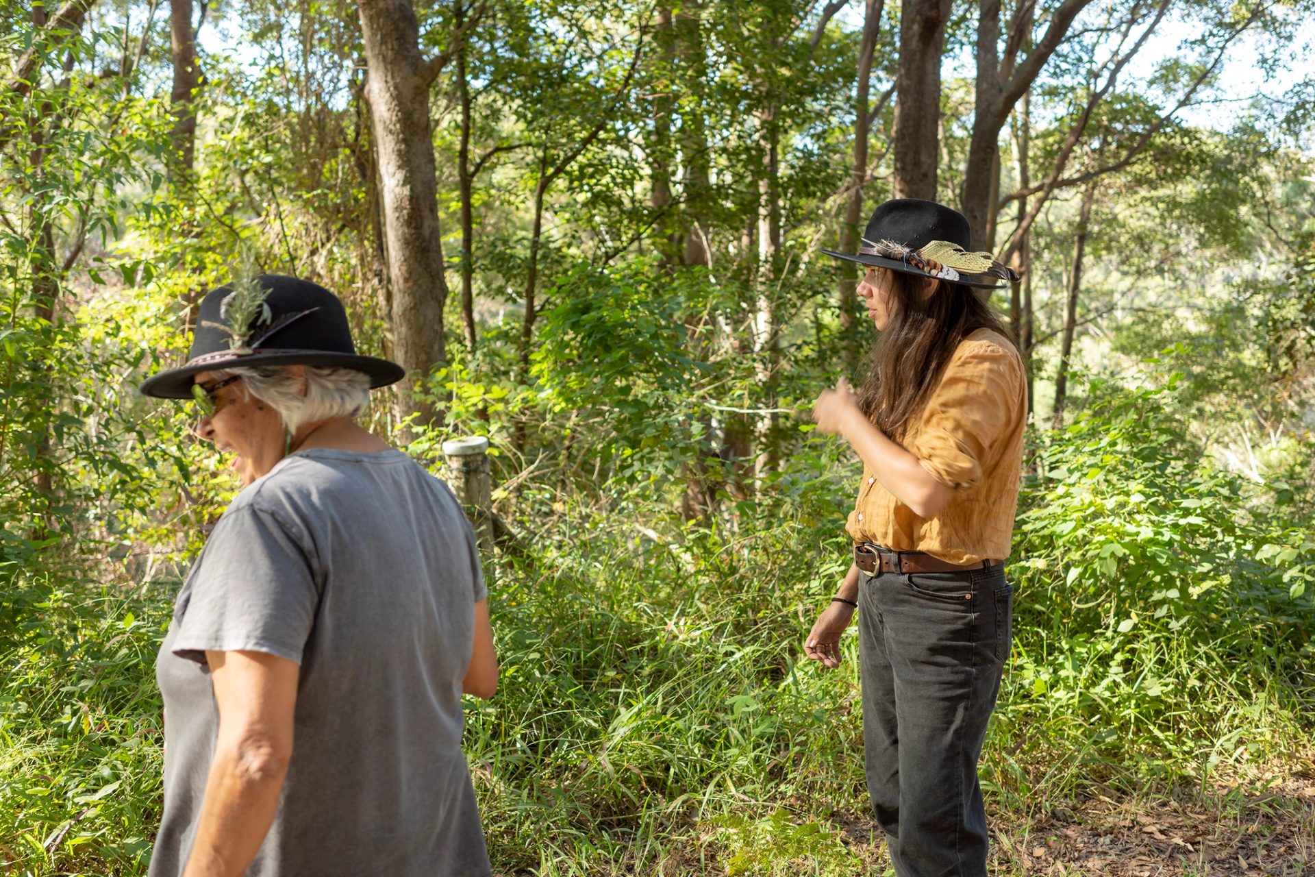
Caring for Country

A Corner of the Empire

The Garden Palace

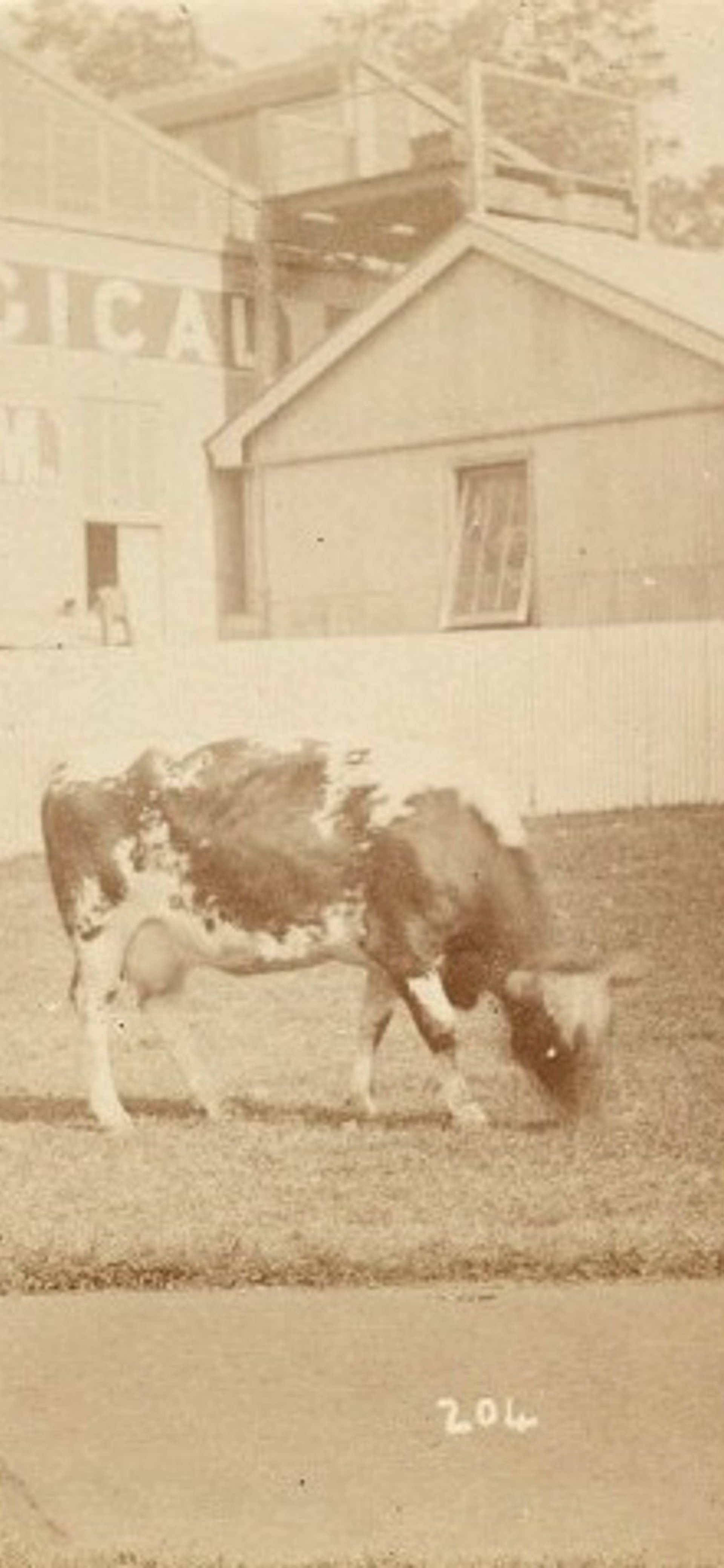
Sepia photograph of the Technological Museum and a cow in the foreground

The Holding Pen

The Agricultural Hall

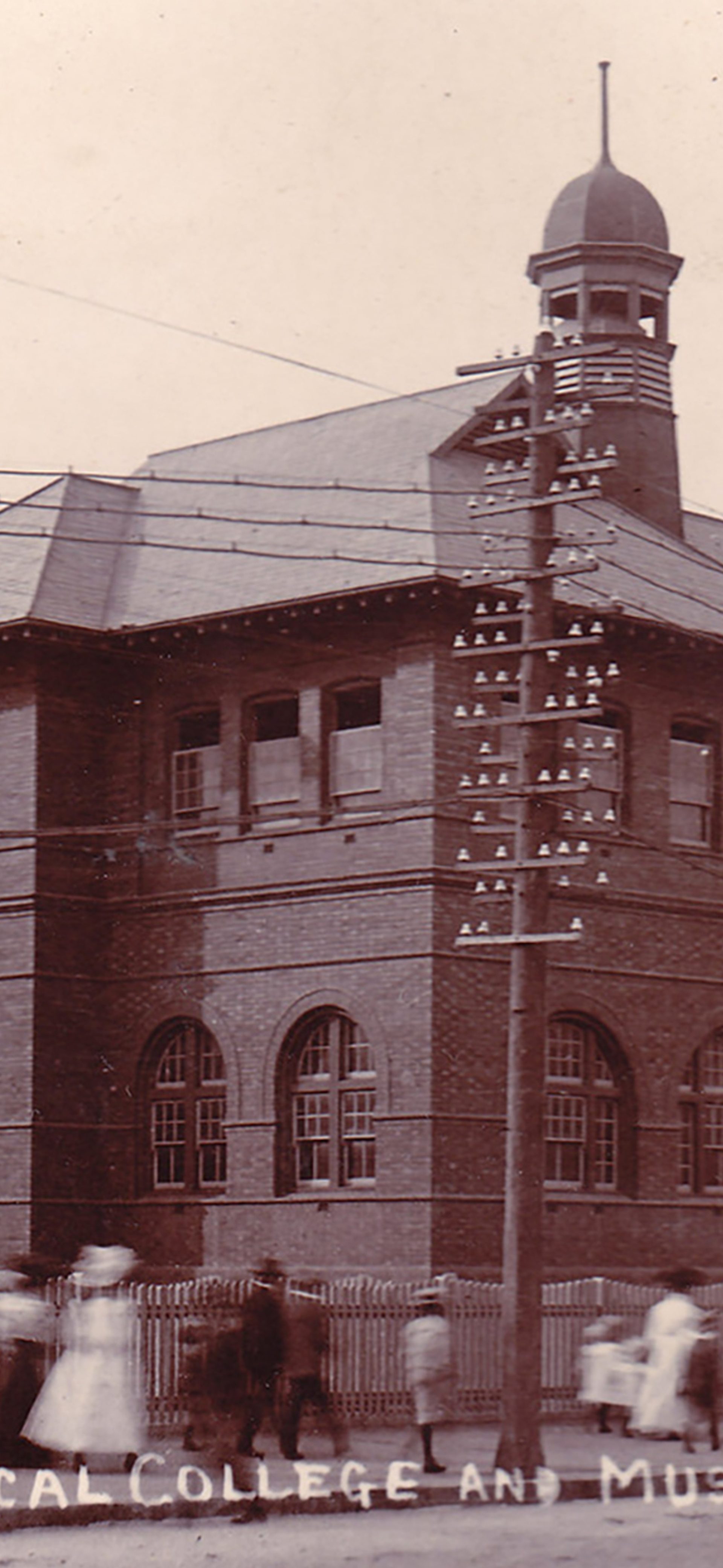
Sepia photograph of the Technological College and Museum in Broken Hill

Regional Networks

Across New South Wales

A Museum of Doing

Technological Museum

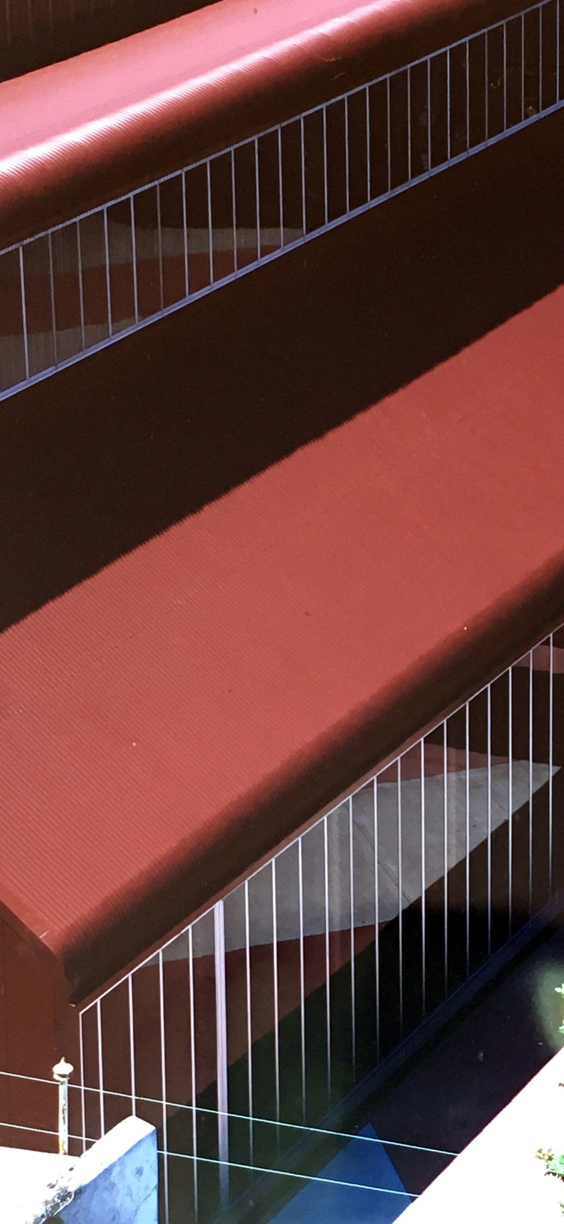
Colour photograph of red corrugated iron building from a high vantage point

Transforming the Tramsheds

Powerhouse Stage 1 and the Harwood Building

A Symbol in Time

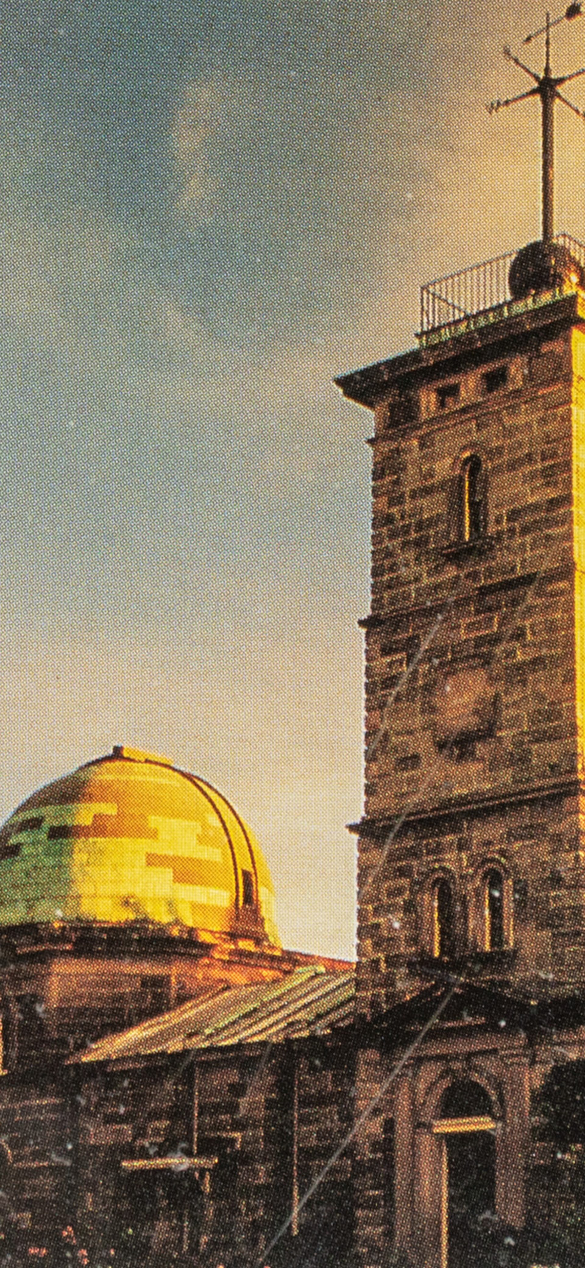
Sydney Observatory

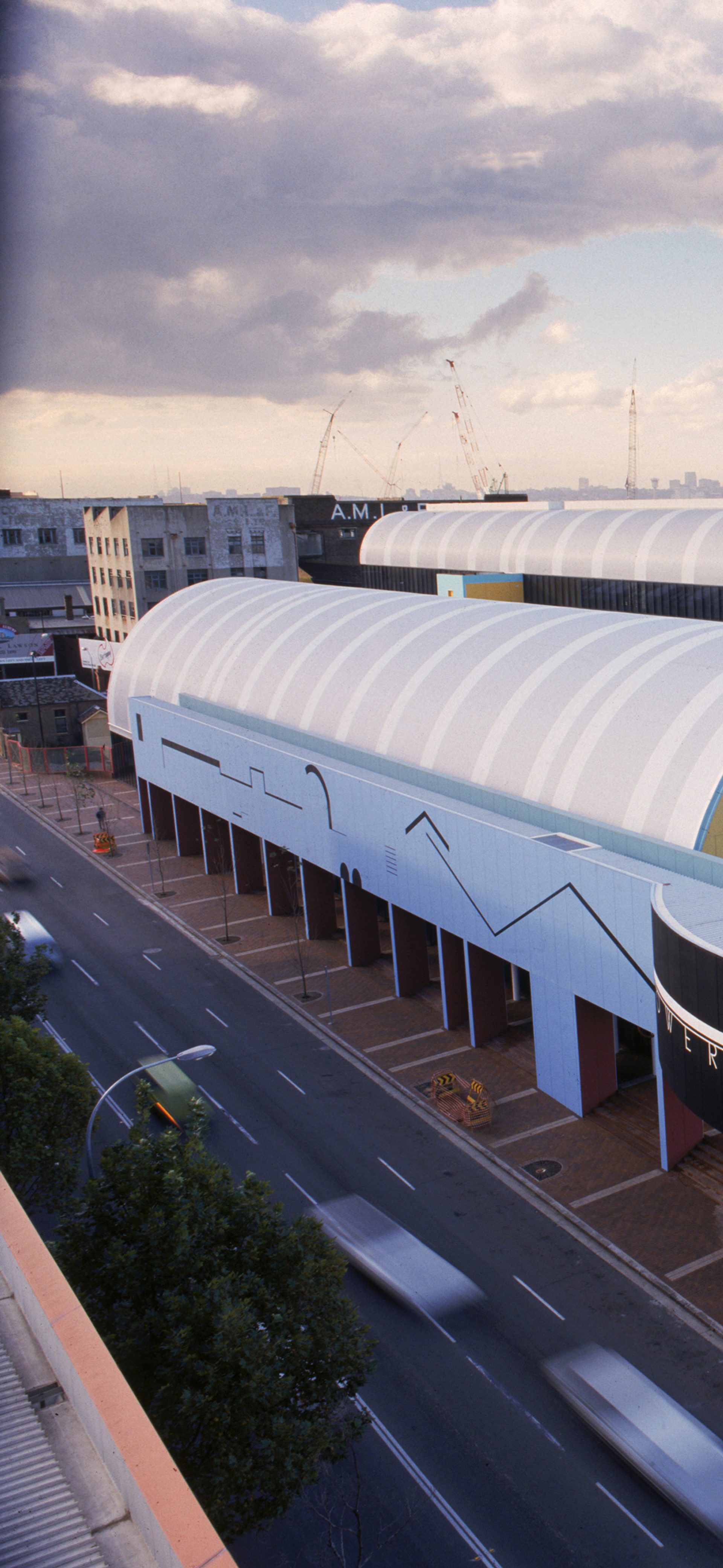
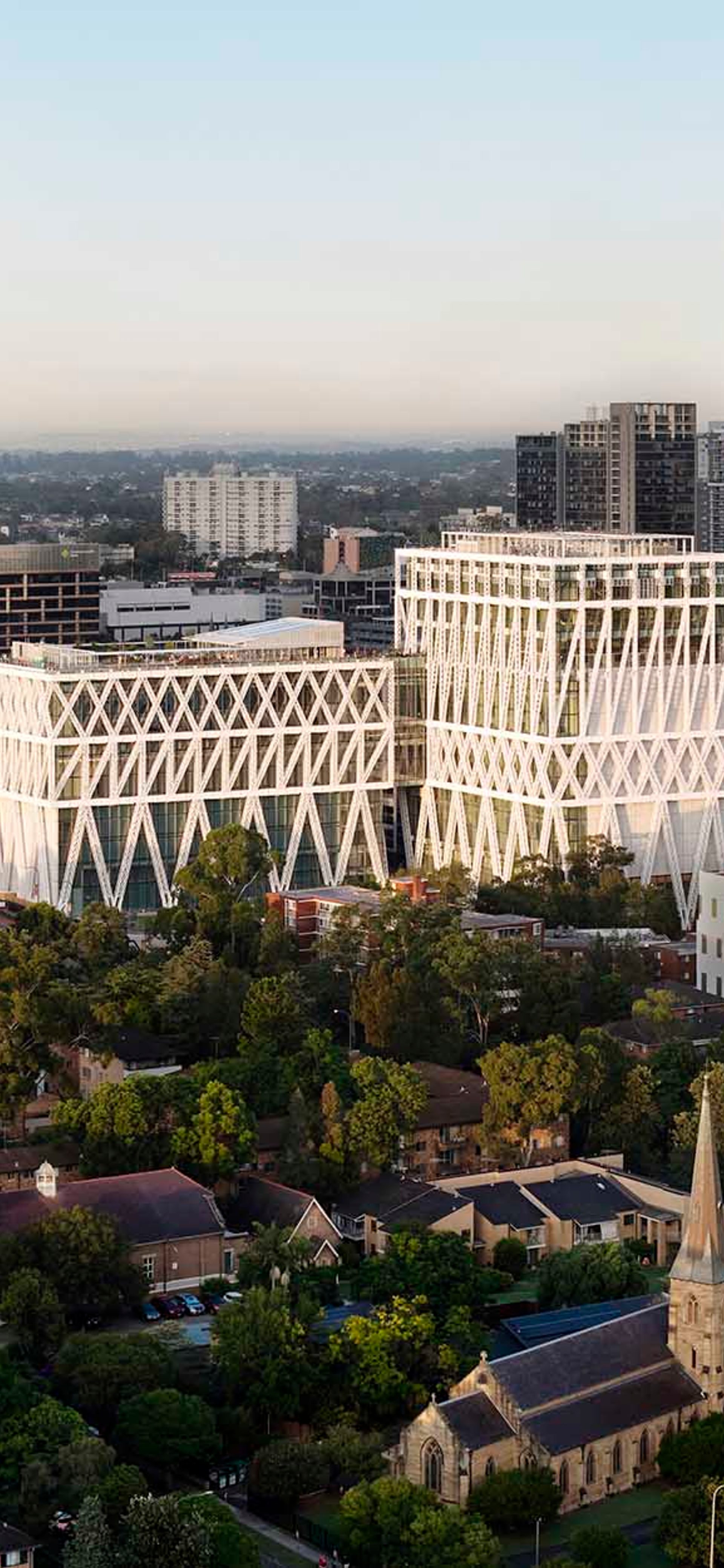
Powerhouse Museum, Stage 2 exterior from high angle, city skyline in background

Ongoing Transformations

Powerhouse Ultimo

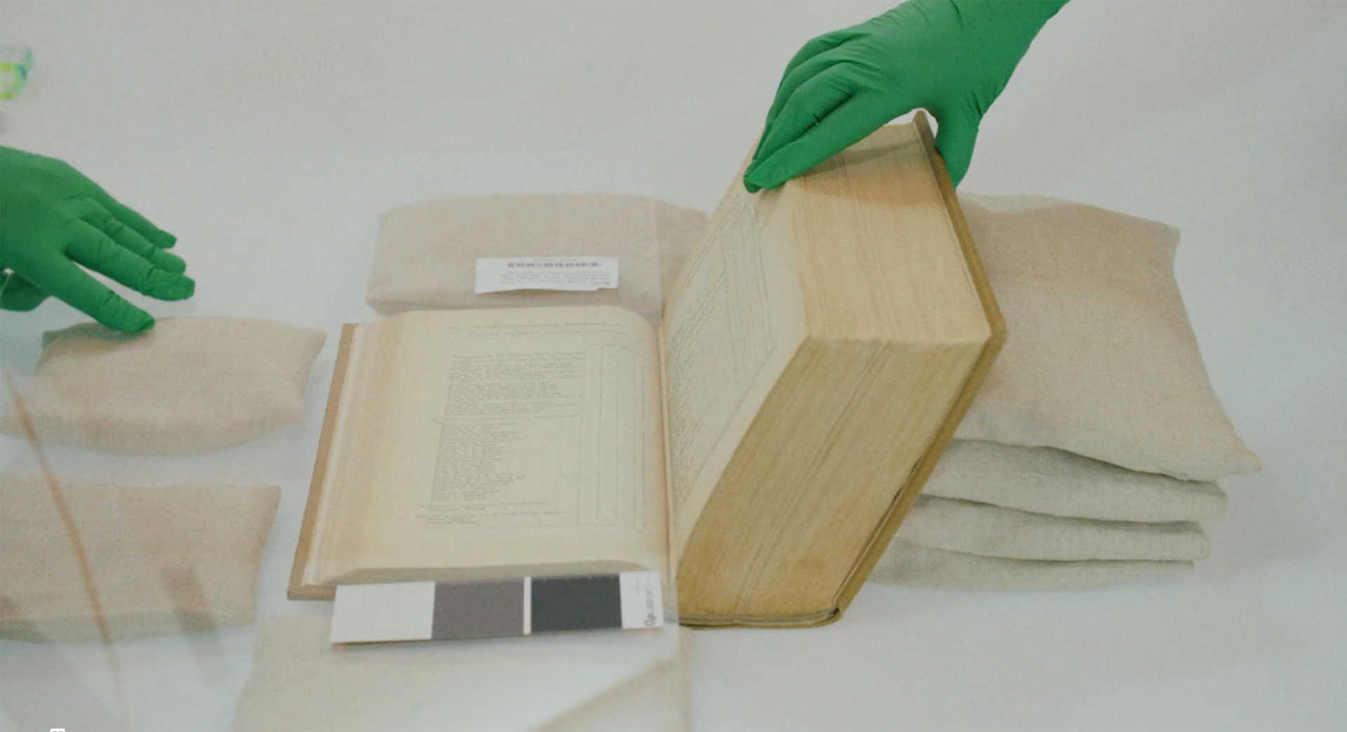
Blurred image from film with museum object number

Applied Arts and Sciences

Defining the terms in the 21st century

Powerhouse Renewal

Tom Fereday

Powerhouse Castle Hill furniture commission

Two people standing next to a cow in a field of cows.

Powerhouse Food: Producers

Across Western Sydney24 Aug 2024 — 25 Jul 2025

We Rise

Blak Powerhouse

A tall rocket with a long trail of burning fuel lifts off from a launchpad at Cape Canaveral.

Powerhouse-1 Mission Launch to the ISS

An initiative of the Powerhouse: Future Space program

Photofields

Across Sydney6—7 Dec
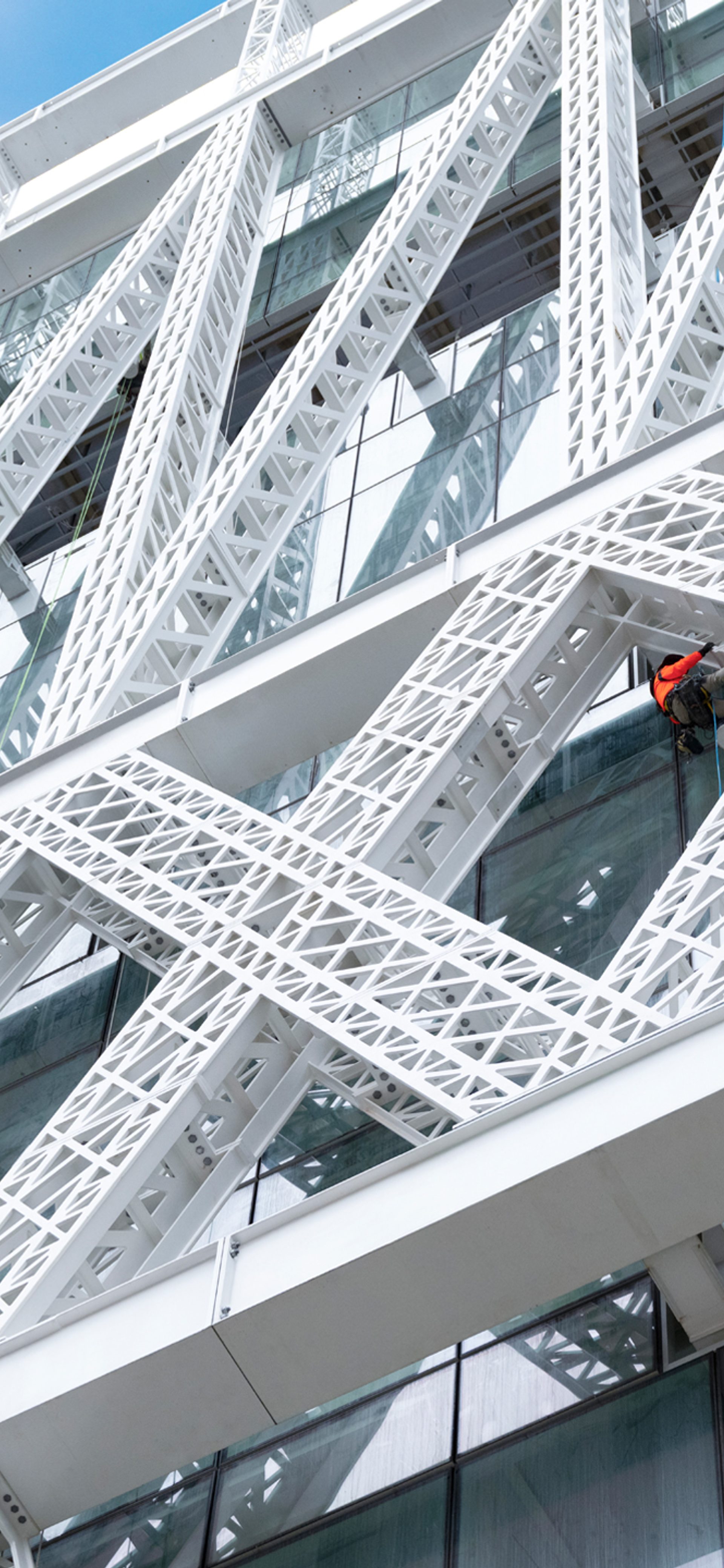
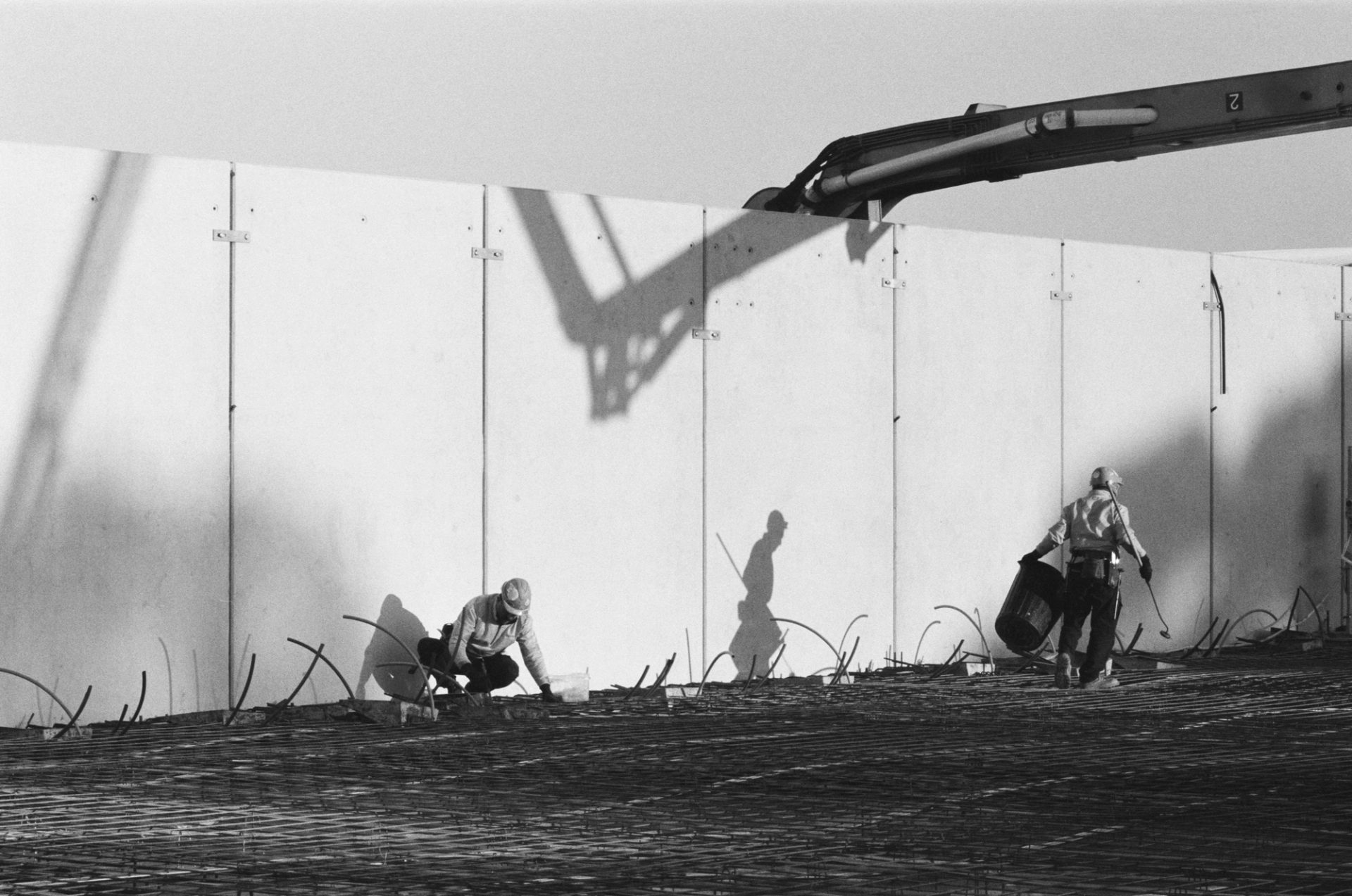
Shadows cast by the Powerhouse Parramatta exoskeleton on concrete

Exoskeleton

Powerhouse Parramatta

A woman stands on stage in front of a large audience. She has her left hand raised in the air and a microphone in her right hand. The audience are holding their phones up recording the woman.

Blak Powerhouse

Powerhouse x We Are Warriors

Slider thumb2024
Stories

Tom Fereday

Powerhouse Castle Hill furniture commission
Images by Hamish McIntosh, Evostyle and Tom Fereday, interview by Stuart Ridley
I realised a long time ago that what works for me is collaboration: when I can find the right people to work with, we can push off each other to make a greater result than perhaps we could have done individually.
Tom Fereday, designer

Tom Fereday’s fascination with the tension between natural materials, design and manufacture developed early – his Dad was an antiques dealer in London – and he remembers fleeting moments with ‘everything from Victorian to Turkish wooden artifacts to 60s and 70s Scandinavian pieces’ while growing up in a ‘rotating house of objects’.

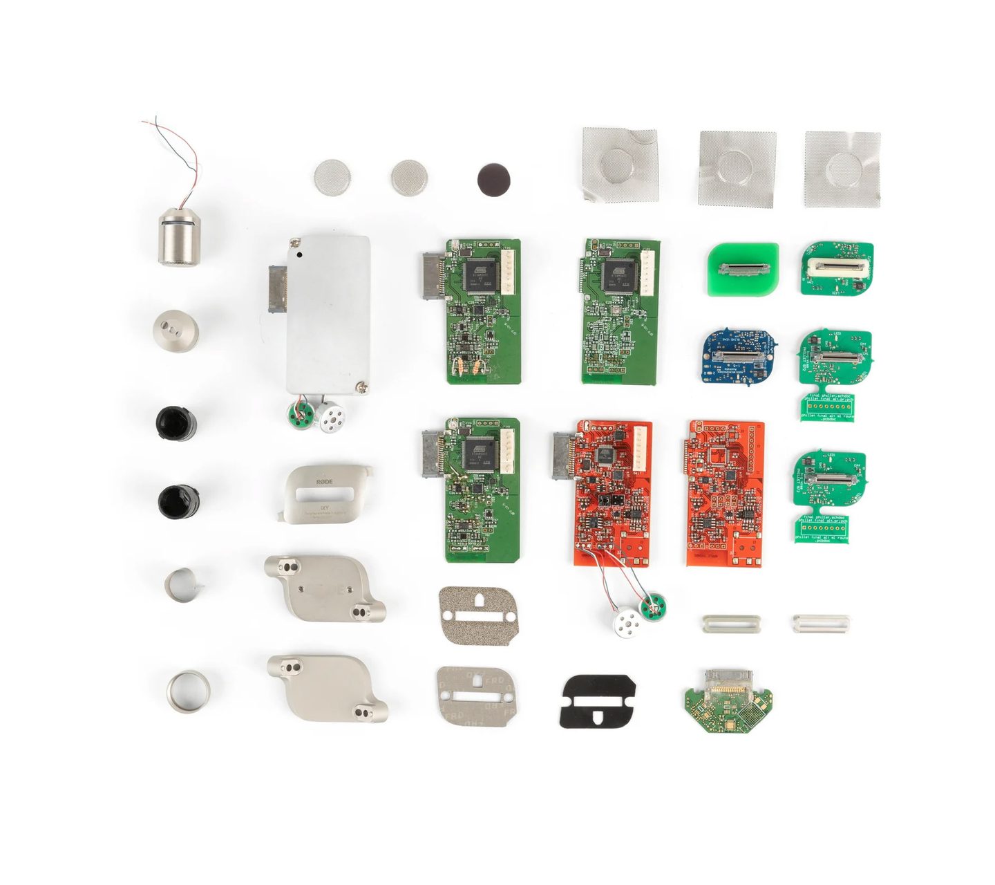
Though he initially studied Sculpture and Graphic Design at Wimbledon School of Art, he found the freedom of creating his own narrative 'overwhelming'. Fereday returned to Sydney (his birthplace) and enrolled in Industrial Design at the University of Technology Sydney, where he thrived under the constraints and problem solving inherent in object design – gaining first class honours. His early career spanned Europe and Australia, including stints with Marc Newson Limited in London and RØDE Microphones in Sydney before establishing his own practice, Tom Fereday Design, in 2012.

Collaborations with brands such as Louis Vuitton, Alessi and Stellarworks have been presented internationally, and his works have been exhibited at Powerhouse Museum, Art Gallery of New South Wales, Museum of Contemporary Art Australia and The Australian Design Centre.

In 2023, design consultant Emma Elizabeth worked with Powerhouse to commission Fereday to design a large spotted gum ottoman for the entrance to the new Building J at Castle Hill. He developed it in collaboration with Evostyle, a local master woodworking business based in South Windsor. He then gained two more commissions: a series of cast aluminium cafe chairs and four spotted gum Sibling Chairs as part of a meeting room collection featuring eight Australian designers.
Stuart Ridley spoke with Fereday about his design values, collaborating with artisans and the importance of cultural institutions to the design world.

Stuart Ridley: What drives your creative practice, particularly your enthusiasm for collaborative works?

Tom Fereday: While other people may act like a brand and develop a collection for sale, everything we work on begins as a collaboration: it could be with an institution, a gallery or a brand. A lot of the work is an exploration of a new process, which I'm excited to learn from these incredible makers. I've been lucky enough to work in anything from cast glass to fine woodworking, which inevitably involves collaboration with makers and manufacturers. There's a journey that's not just me as a designer. It's very holistic: it’s not just a product, there's a story to what we've created.

SR: You grew up surrounded by objects that had history, were handmade and human centred: designs that people feel something when they see them, when they interact with them. How did those elements influence you?

TF: When I started doing my own work – as a creative outlet from pure mass production of objects – I was able to physically make and prototype the pieces, which is removed from the completely computer-based design approach I'd experienced before. There's an emotional connection for me to the objects, and if you can convey it, people understand where it's been made, how it's been made. I think the story and origin of an object adds to people's perceived value of it.

I've been really fascinated by working with an array of makers, materials and brands, and that probably comes from being taught about innovation when I did industrial design at UTS. It fostered an interest in materials and manufacture.

Design commissions

SR: What did it mean for you to be commissioned to create furniture for Powerhouse Castle Hill?

TF: The commissions started with the ottoman. That really was the key piece in the collaboration with Powerhouse. When I was at UTS, Powerhouse was the first institution I would go to. So it's very close to my heart.

When they messaged about creating a special piece, I thought that was fantastic. Where else could you create a 4-metre ottoman with dowels and who would commission that? And I think it's fantastic public institutions can support that, because when they invest in designers locally, that support doesn't just go to our studio, it goes to the local community, makers and timber suppliers – it filters across the entire industry.

It can propel people like me, my work and profile. It’s a community support system that's filtering back into Australian design and keeping these businesses alive – myself included.

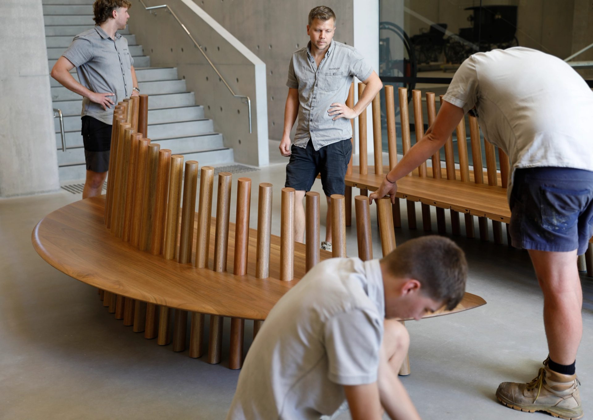
Four men assembling two halves of a large wooden oval shaped seat

Ottoman

SR: What were some interesting parts of the brief for the ottoman?

TF: The brief was to create a meeting point that transitioned from entering the museum to then walking around its surrounds. The origins of the site were very timber related, so we naturally chose a eucalypt tree: spotted gum.

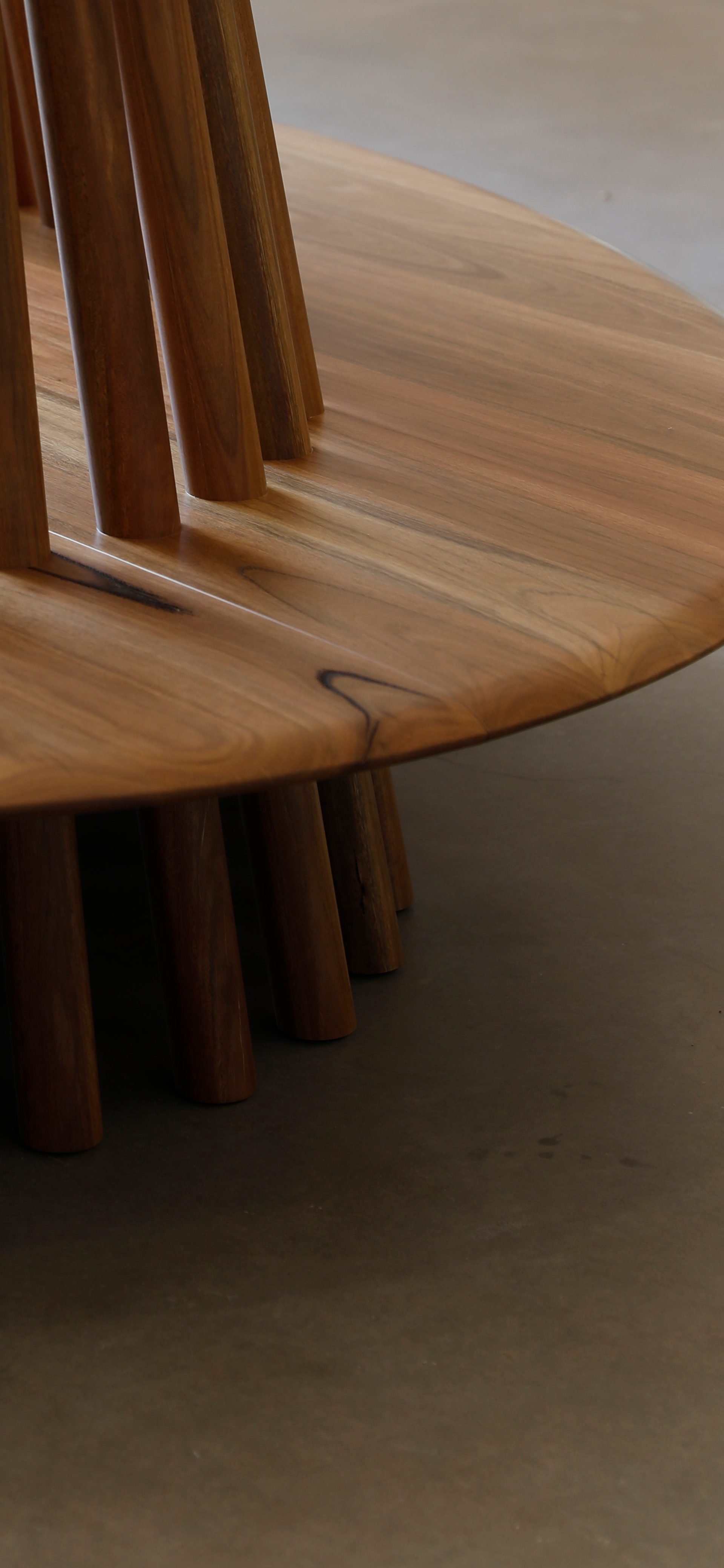
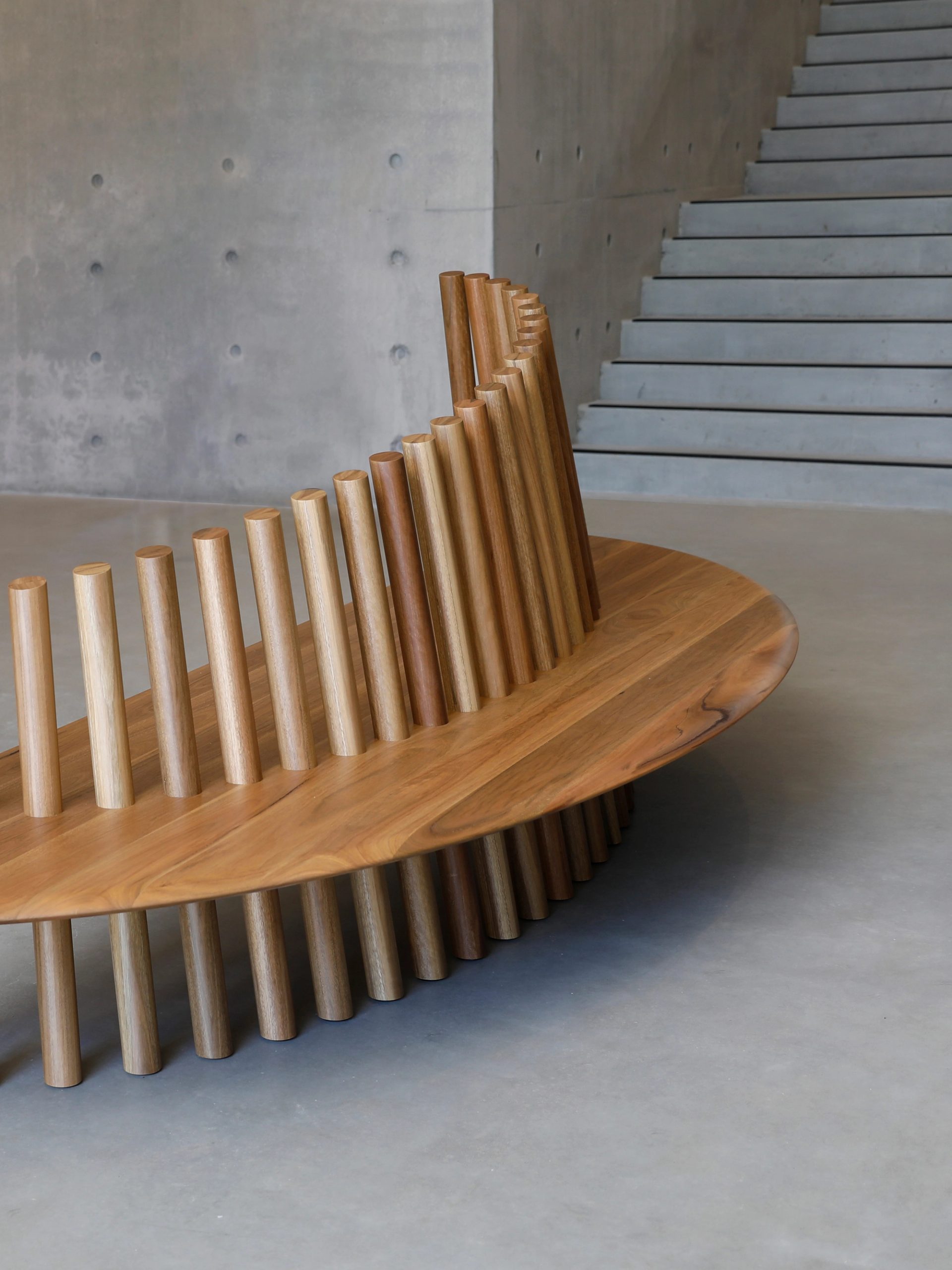
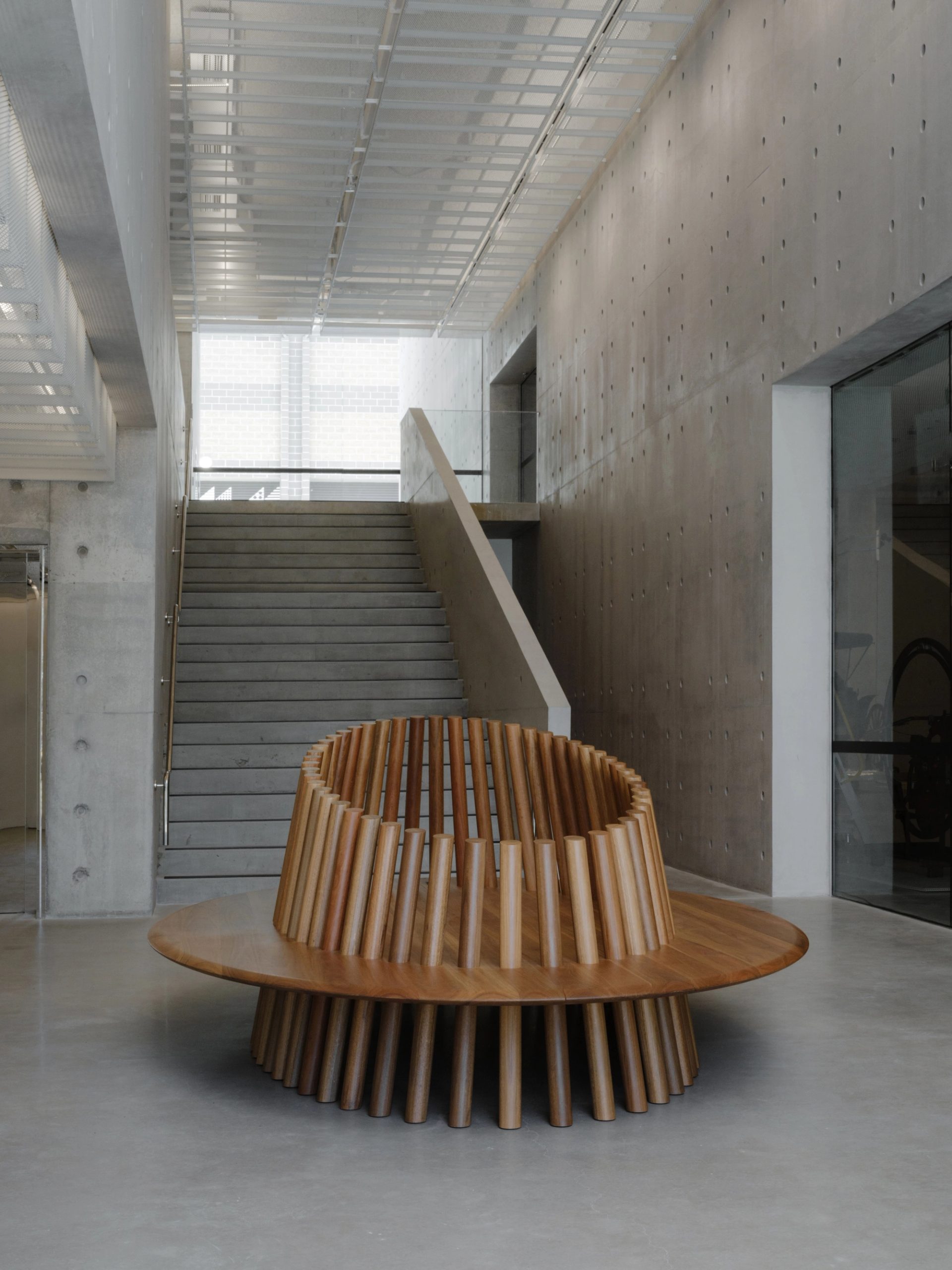
The ottoman is not an object you just look at. It's an object you can sit on and touch and use. Spotted gum is beautiful because it is such a warm tonal and tactile material. You get this beautiful natural variation in the tones. It really paired well with trying to contrast against the environment it’s in, which is a very large concrete space. So we're trying to bring the piece to a more human level.

SR: And you designed it with many big wooden poles to form the feet and centre …

TF: Yes, we came up with this idea for an integrated foot that becomes the backrest and it's all pitched at an angle where you can lean against it. While it looks simple in form, the technicalities of it were complex and only when we began developing it, did we fine tune how we could manufacture and produce it.

The piece spans just shy of 4 meters in length and it's an oval-formed bench seat with a soft shaped edge, then this castellation almost of dowels that takes it into somewhere between a seat and a sculpture. It was a really interesting project because we were attempting a process we had not done before in the studio.

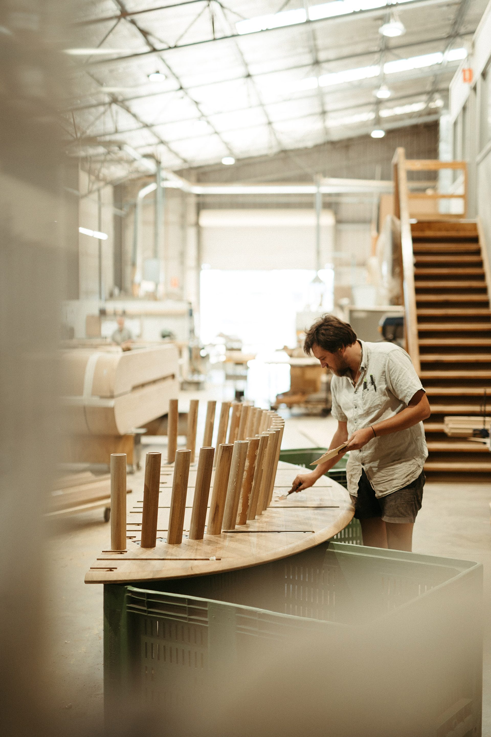
We collaborated with woodworker Evostyle to make it locally. They are a highly sophisticated timber manufacturer and located right by Castle Hill who were able to drive and install it.

It’s really at its limits of what we could lift and carry into the space. Spotted gum is one of the heaviest timbers. Those halves have considerable weight.
The ottoman sits in very contemporary concrete surrounds and so the reverse brief on my side was to try to soften that with a piece that's very functional but also hopefully a sculpture. It can fit into the space and stand out as an object of interest that interacts with people of all ages.

SR: In your photos of the making of the ottoman we can see beautiful circular joints and other details of how it’s constructed – what were some of the engineering considerations in your design?

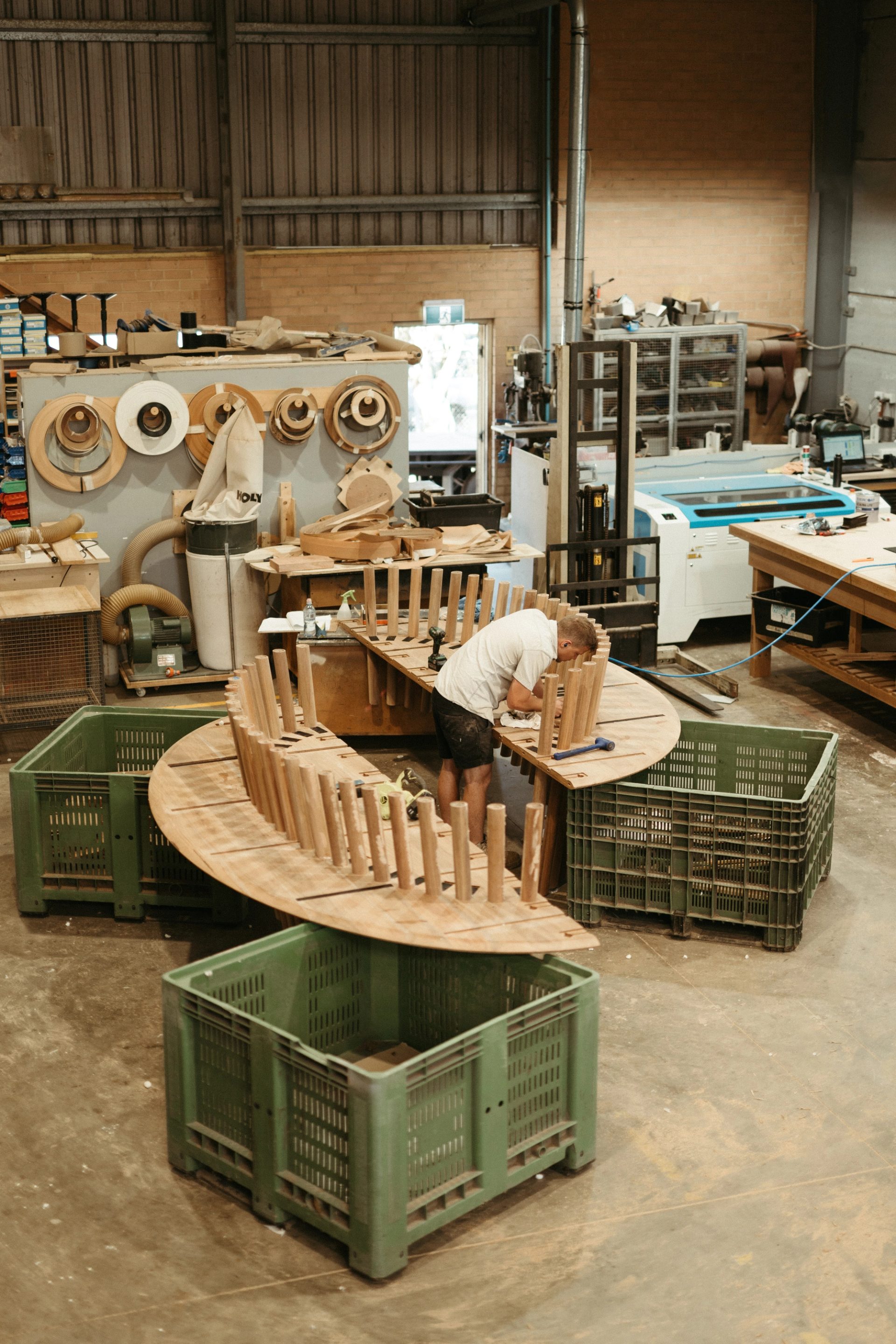
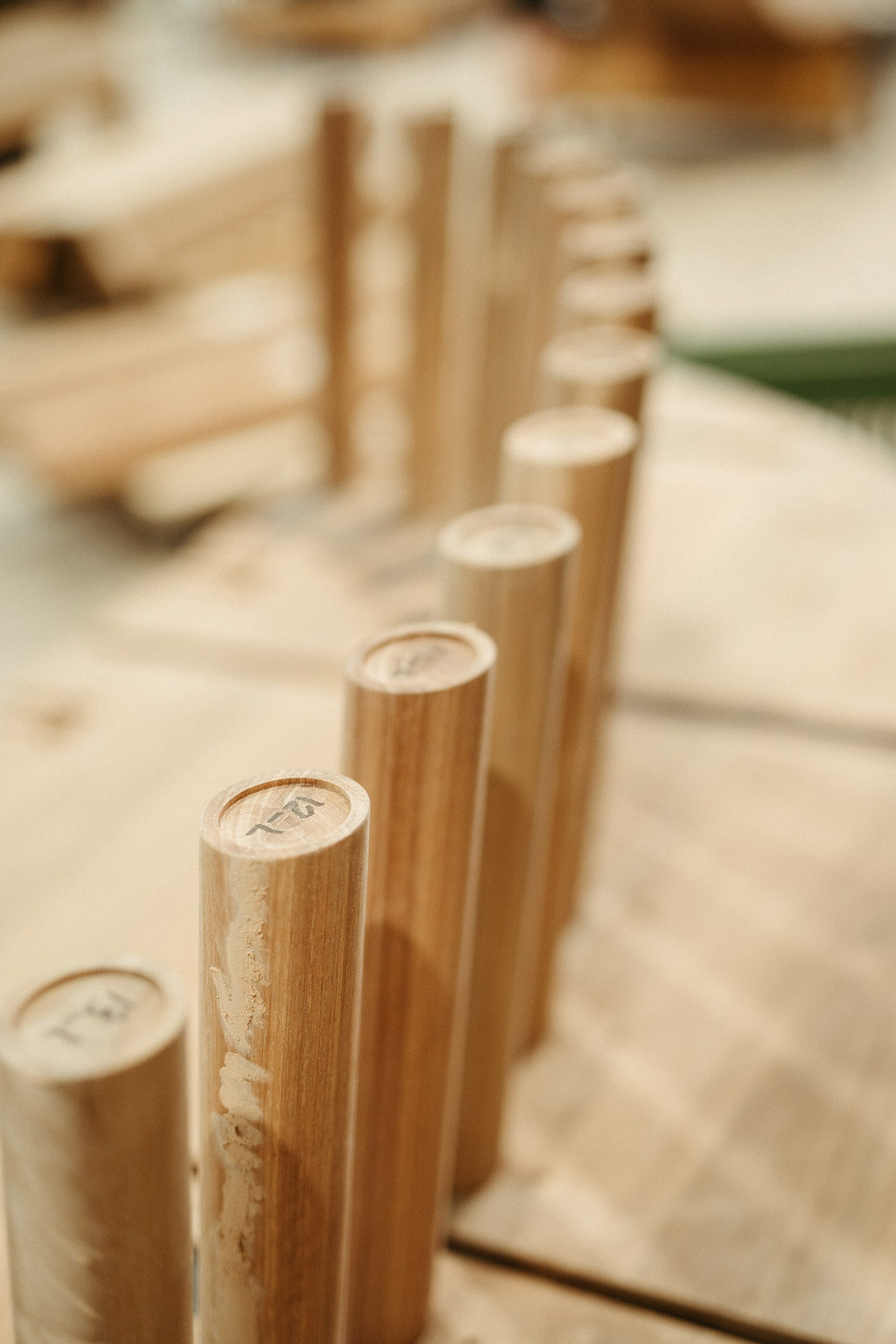
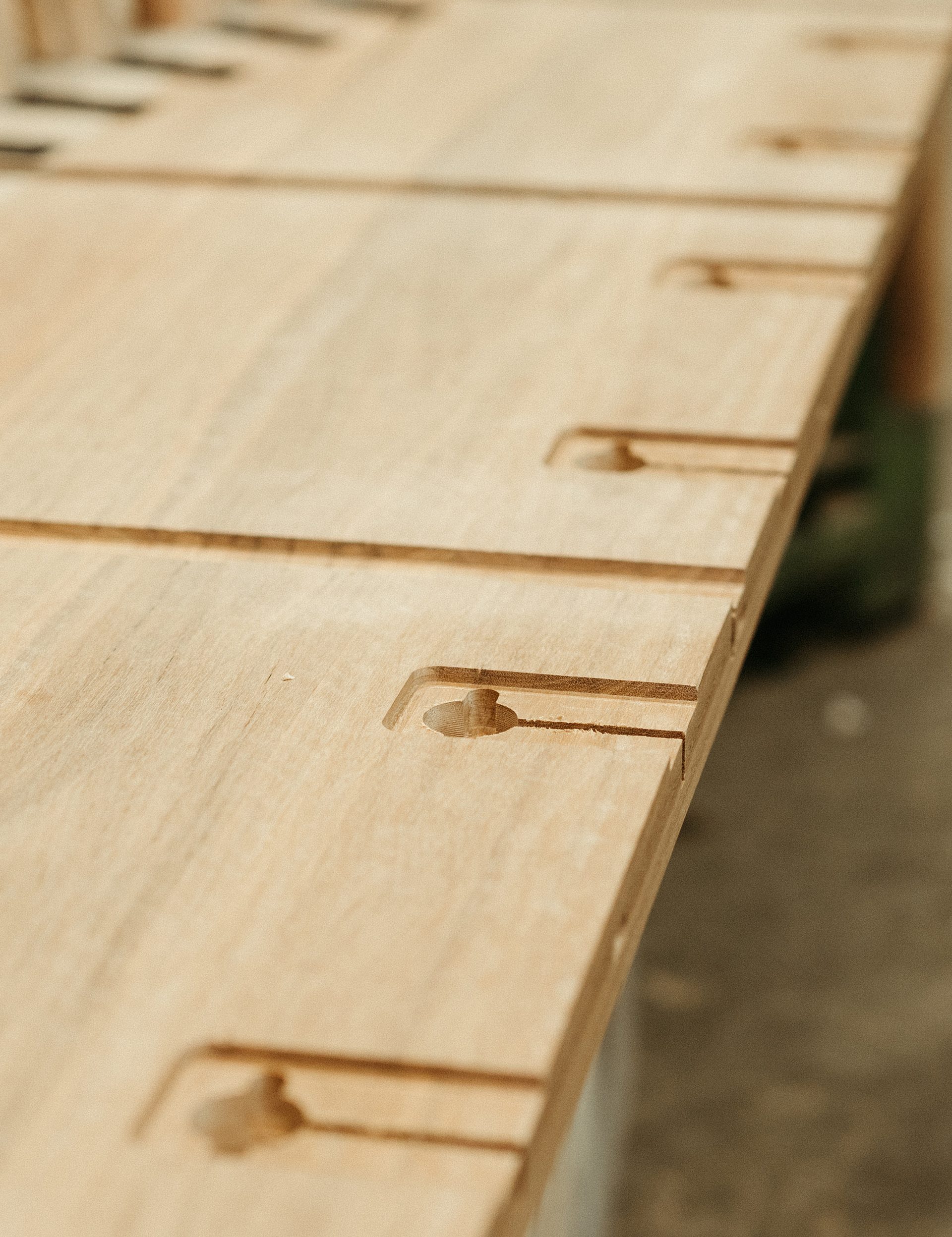
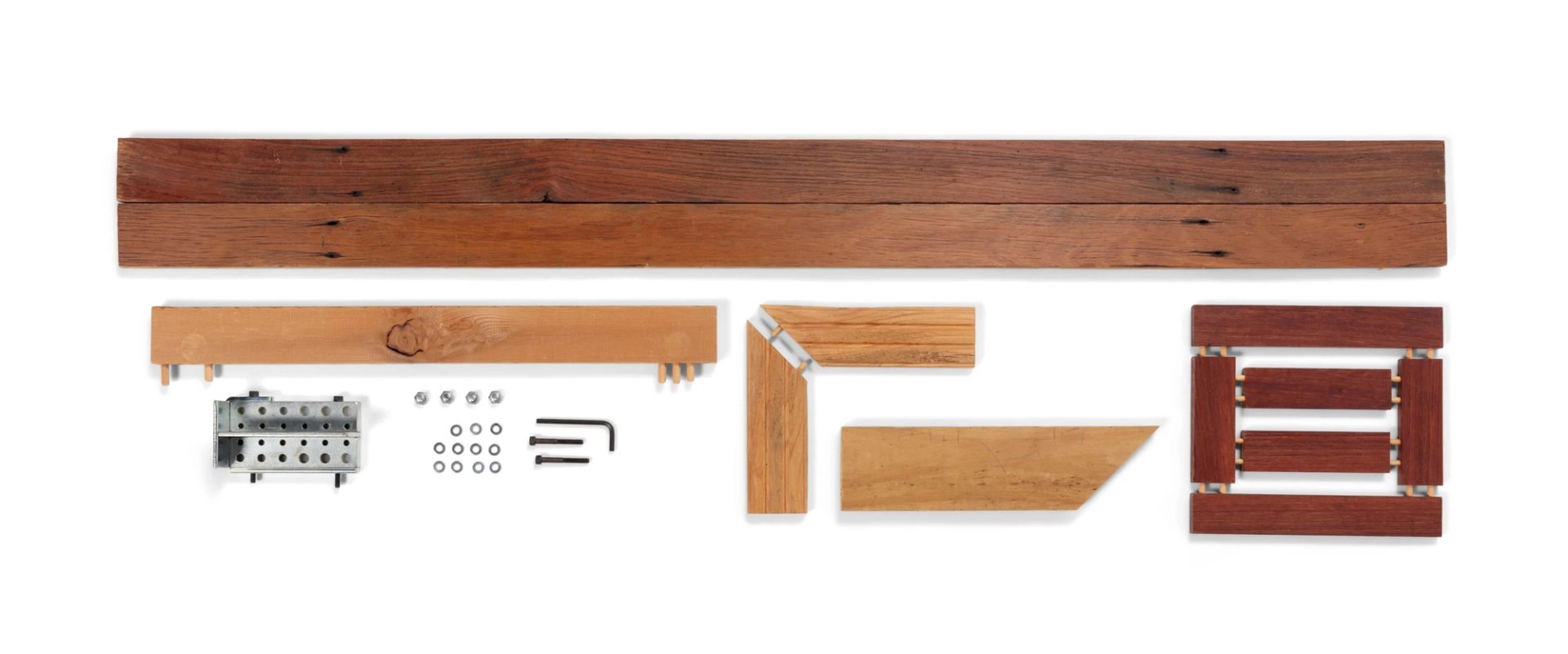
TF: The locking plate system was designed so the dowel runs consistently all the way through, and the details act to stabilise the timber so the natural movement is negated with cross beams that support and hold the piece rigid, then the piece is bolted together in two parts.

And because of this cut you read an oval as you enter onto that front face. But what that meant was every single dowel is individual: even though it's mirrored and they’re all on the same angle, they have to be individually programmed to be machined and then assembled perfectly to get the effect.

We didn't want to show how it was assembled. We wanted there to be a level of intrigue for people as to how it was made when they come and see the piece, and to guess how it might have worked. While it’s quite grand in size, I did not want it to be intimidating so you wouldn't want to go near it or touch it. We want people to use it.

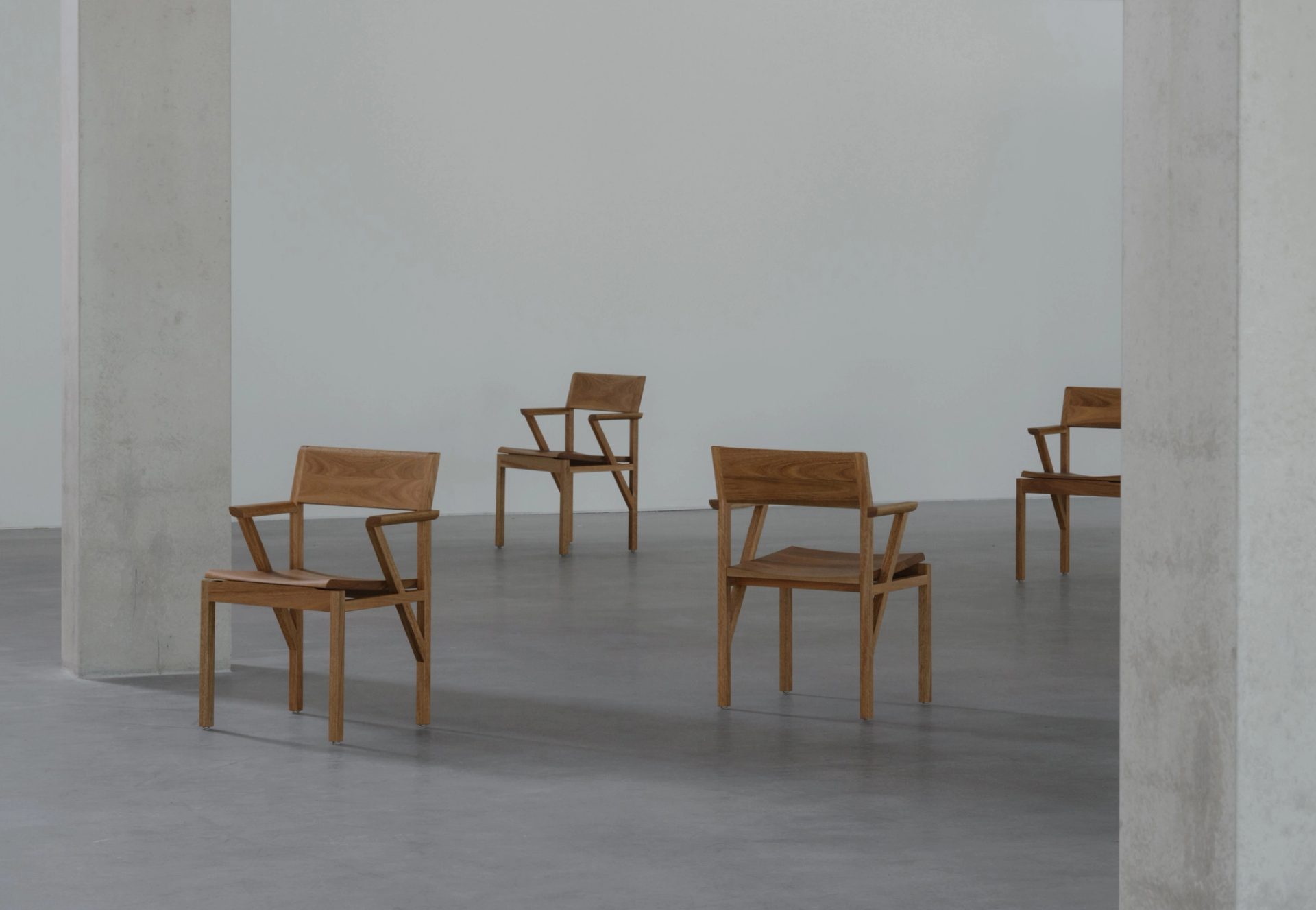
Chairs sitting in a format within a big open room.

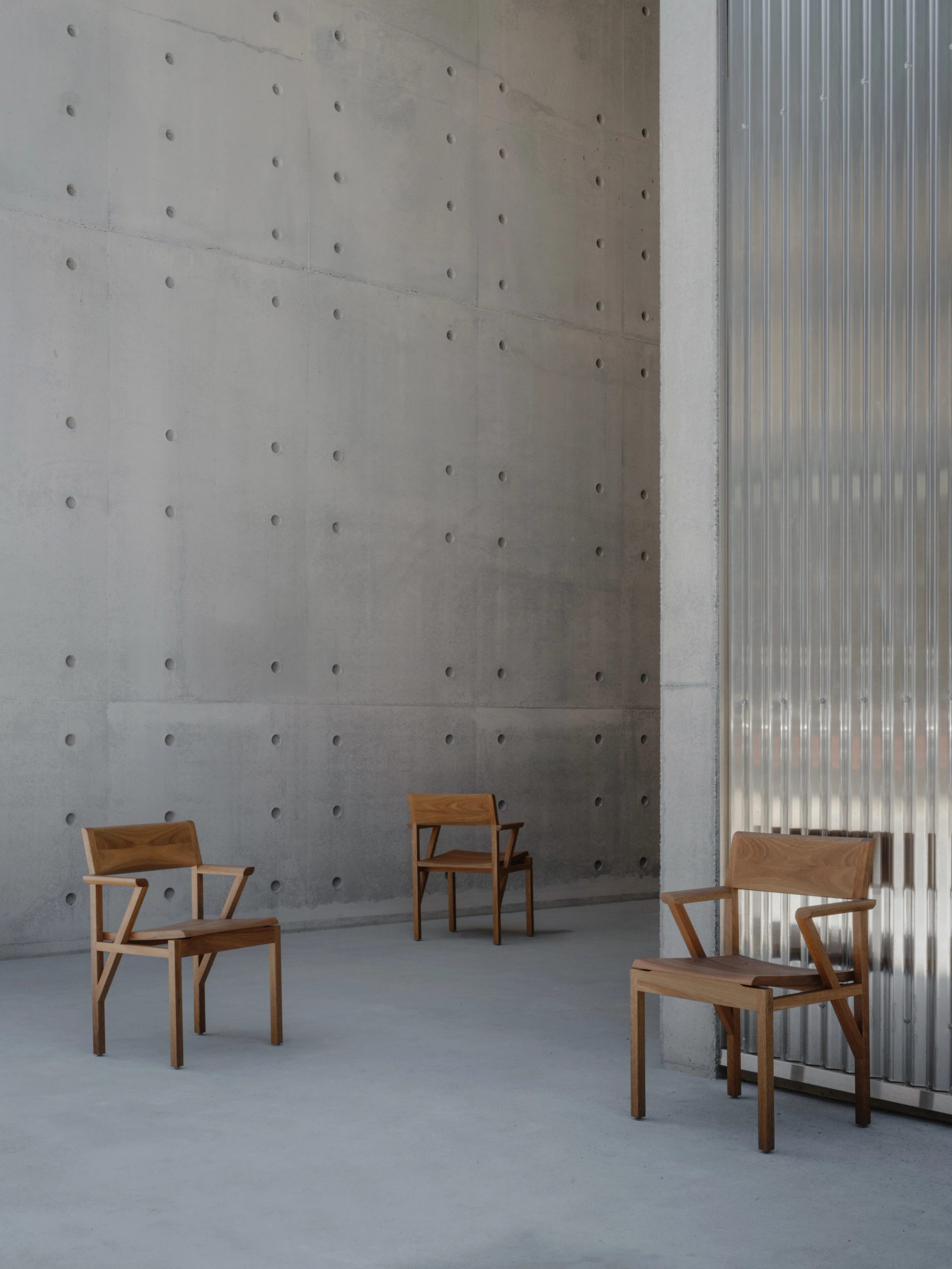
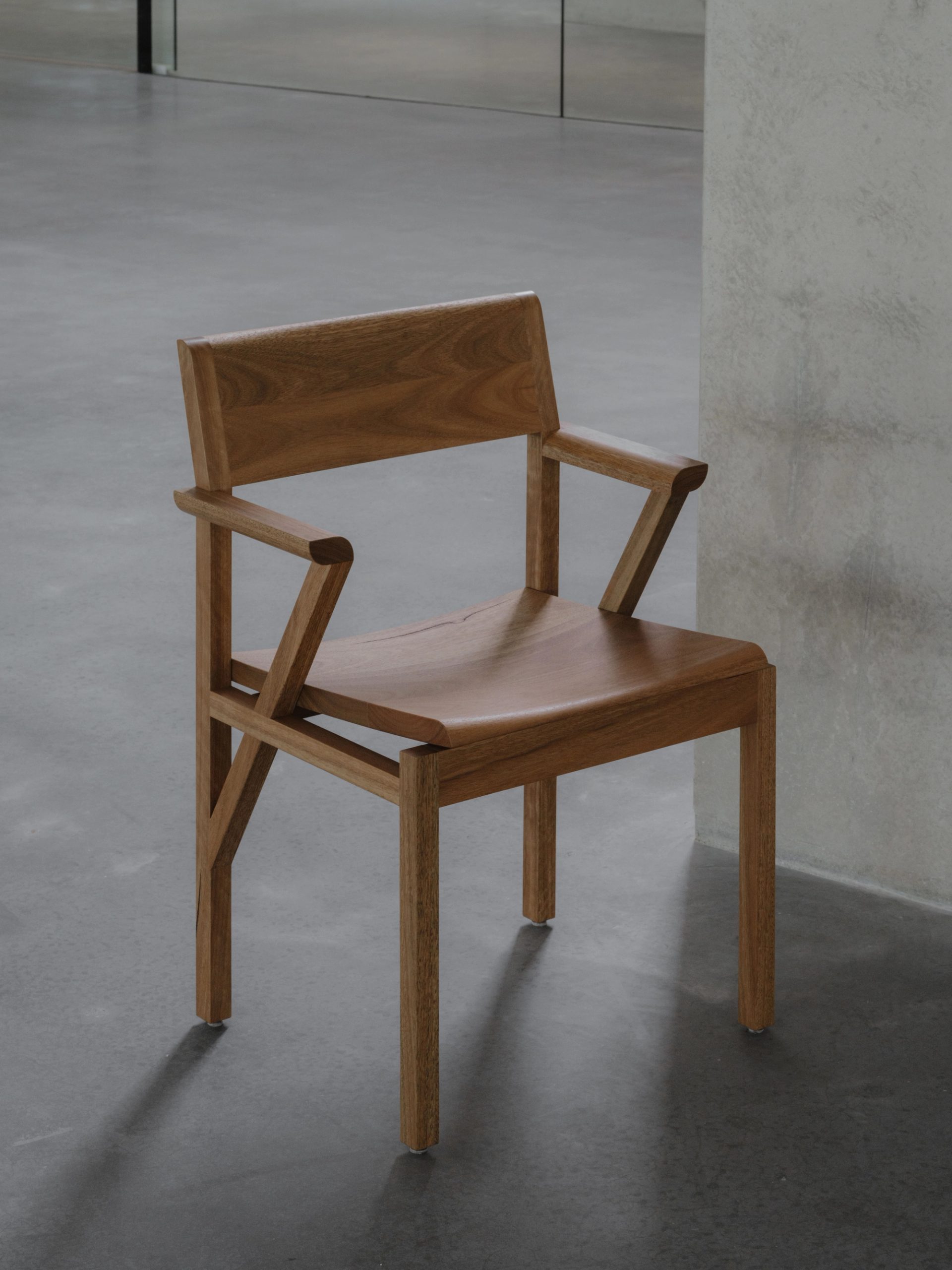
Sibling Chairs

SR: What’s the story behind the name ‘Sibling Chair’ you’ve given to the furniture commissioned for the meeting room at Powerhouse Castle Hill?

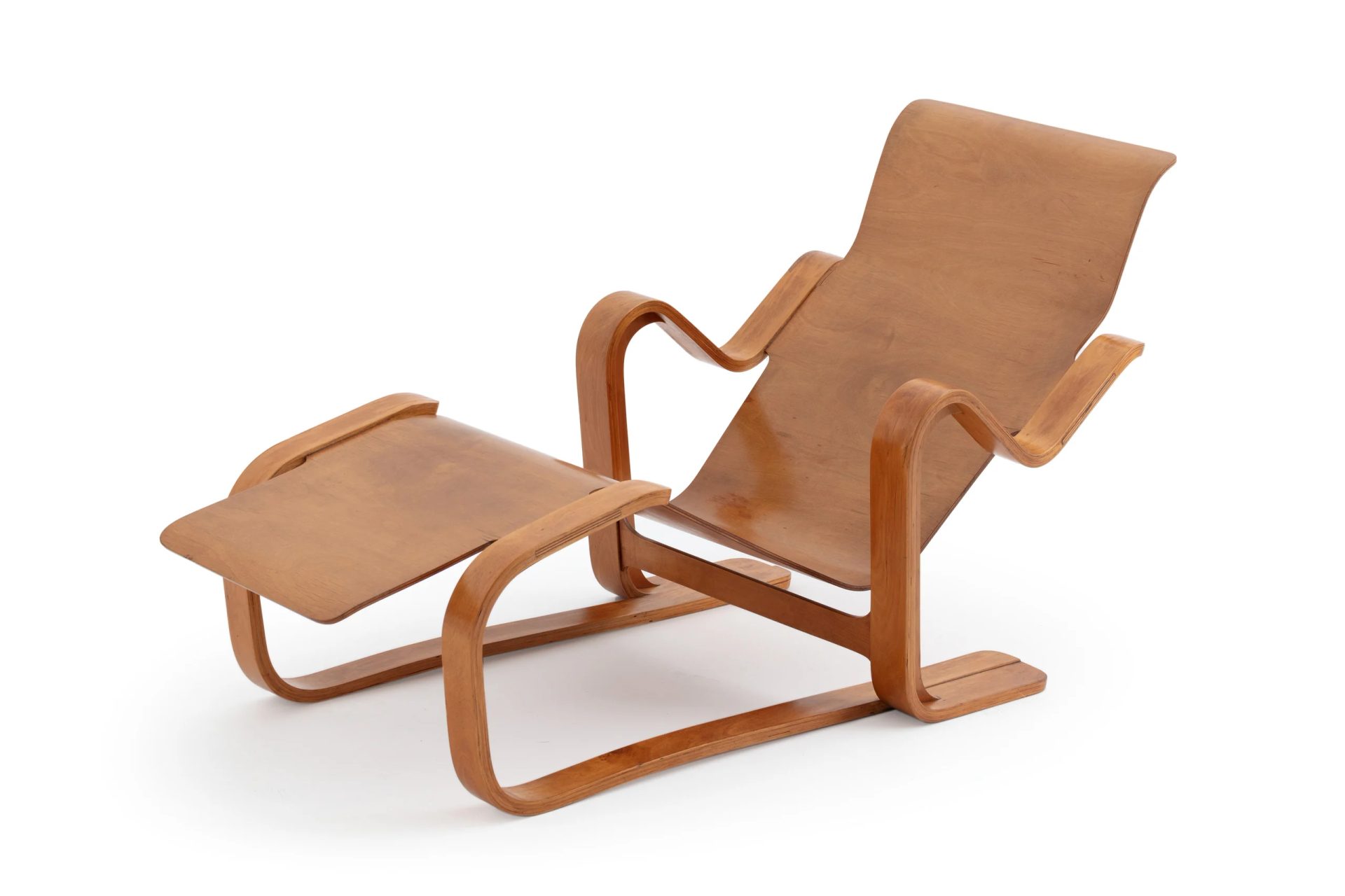
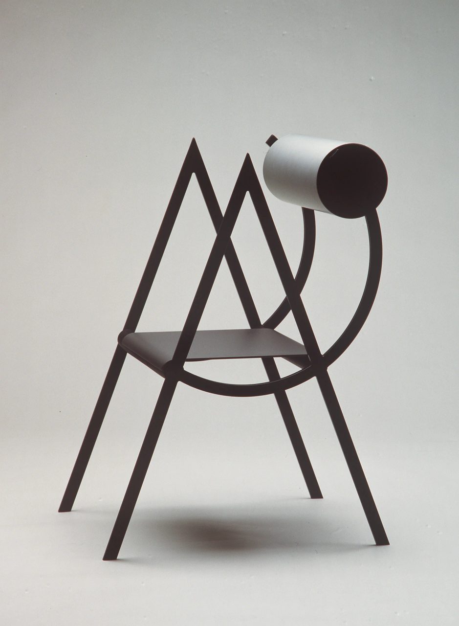
TF: It was originally designed by my brother, George Fereday, 10 years ago as a prototype. We then collaborated on refining the design to turn it into a working piece of furniture, so we called it the Sibling Chair.

Given a brief to create any chair in spotted gum, we naturally looked at some of our existing pieces, and we put this idea forward as an interesting experiment to make something new from the prototype. Working with maker Rolf Barfoed, we ended up softening elements of it and getting the right proportions for comfort.

SR: Some wooden furniture can feel quite hard, these seem softer and well, kinder.

TF: I didn't learn that for a little while about the real use of pieces, because a lot of these things take time to learn. Originally you're making expressive works and then you’re having to ground it to be functional. There's always a tension and sometimes I get it wrong. As I've gotten older and done more work, it's hopefully getting better.

The cost of making furniture in Australia is really high and every detail is a cost factor. It can be difficult to get soft ergonomic curves and be affordable. But I do think that where humans touch the piece of furniture – really strongly with seating and elements of tables – I think that should always be really considered from a human factor.

Arc Chairs

SR: Design for the human touch is also visible in the metal chairs you’ve made …

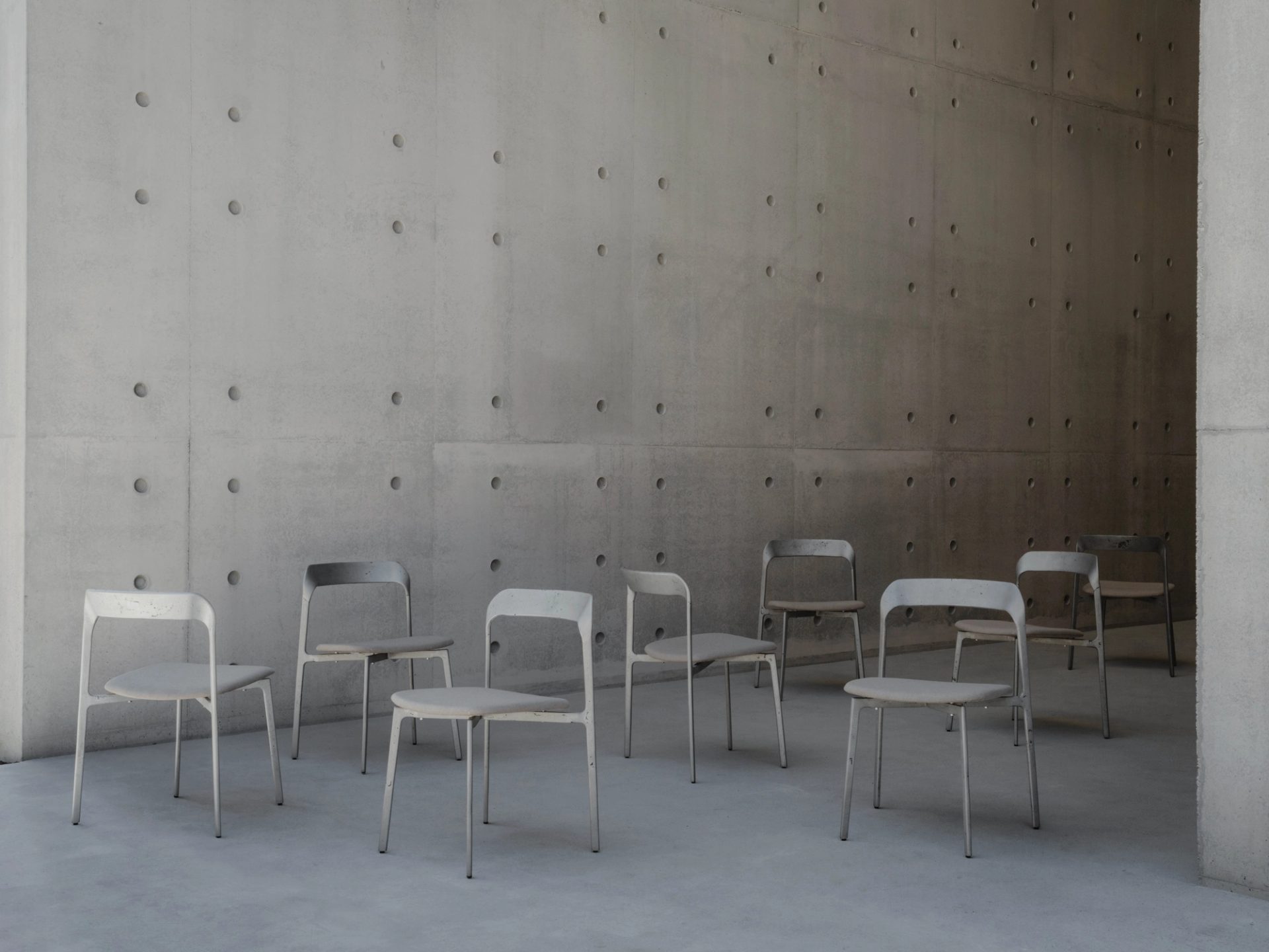
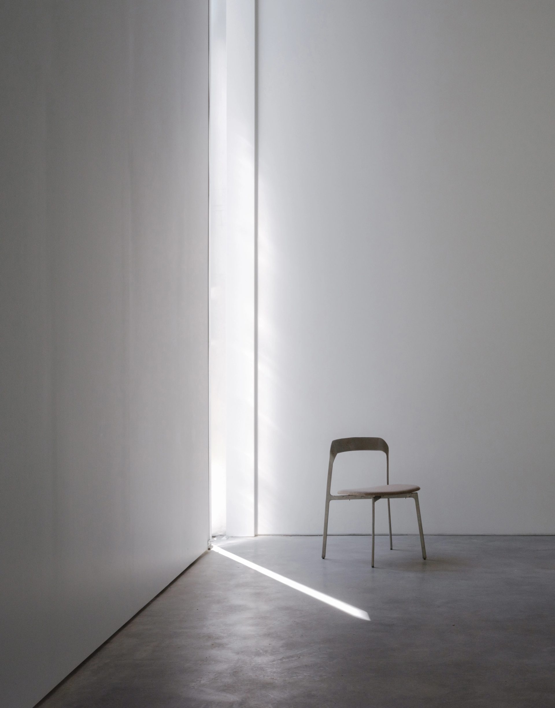
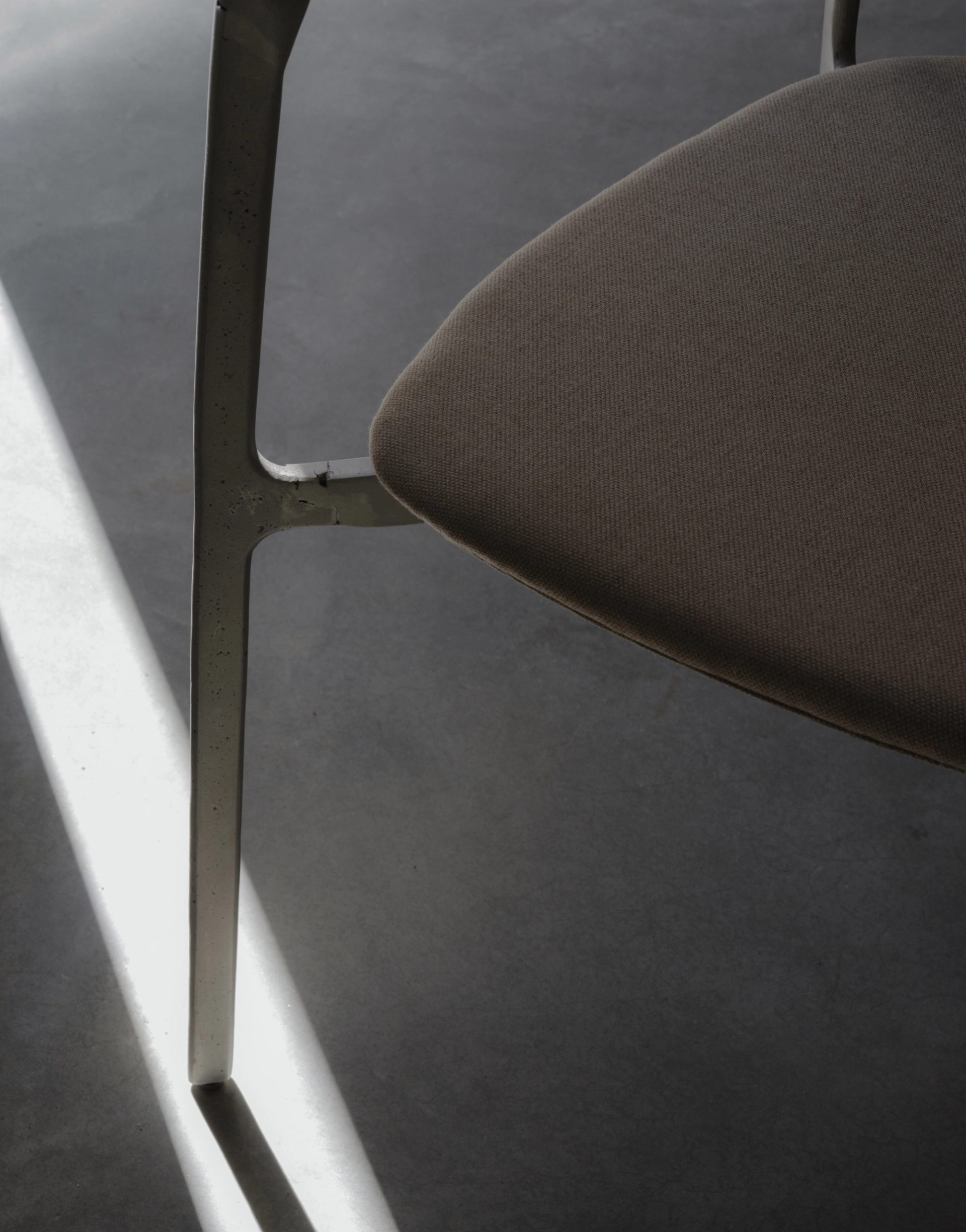
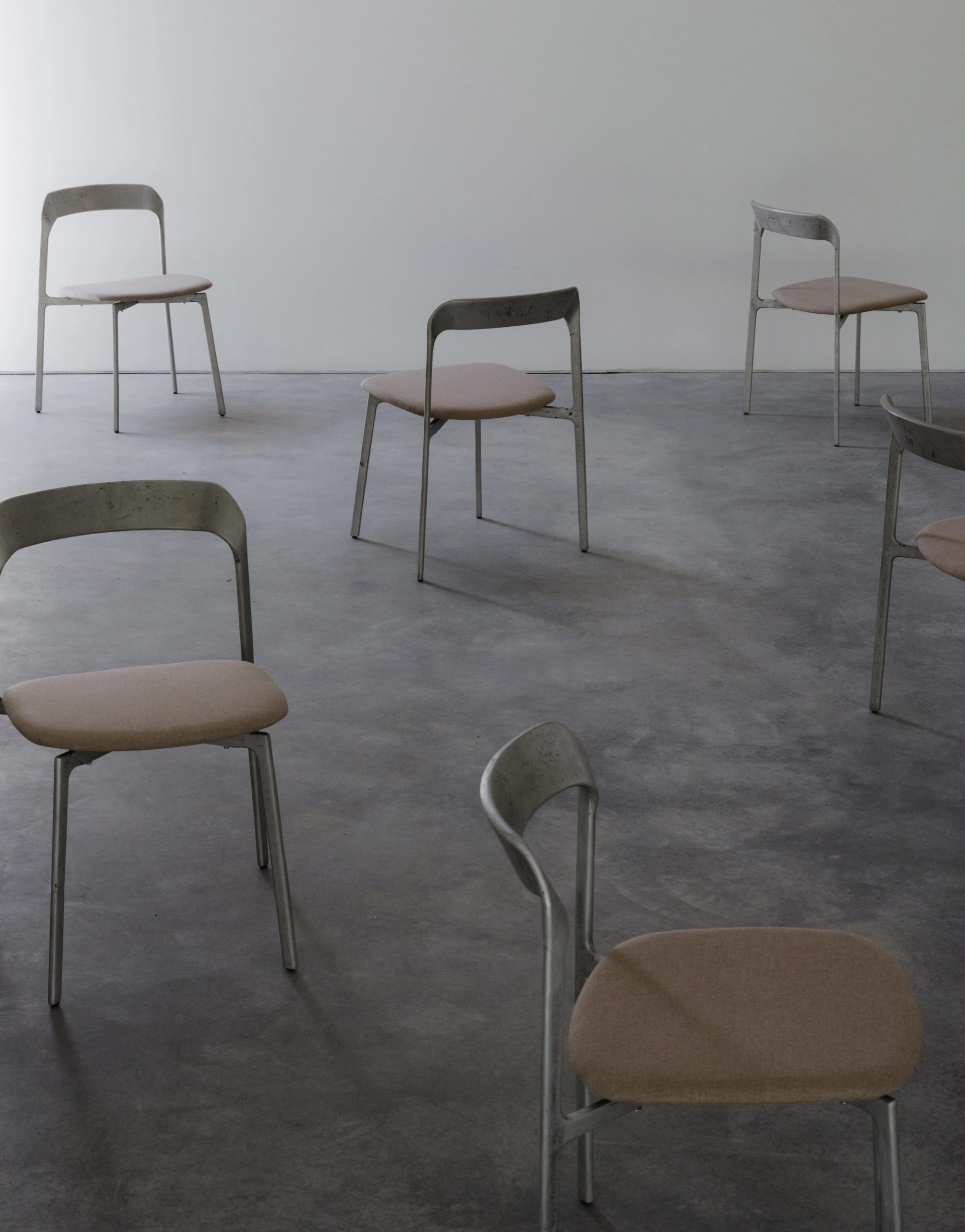
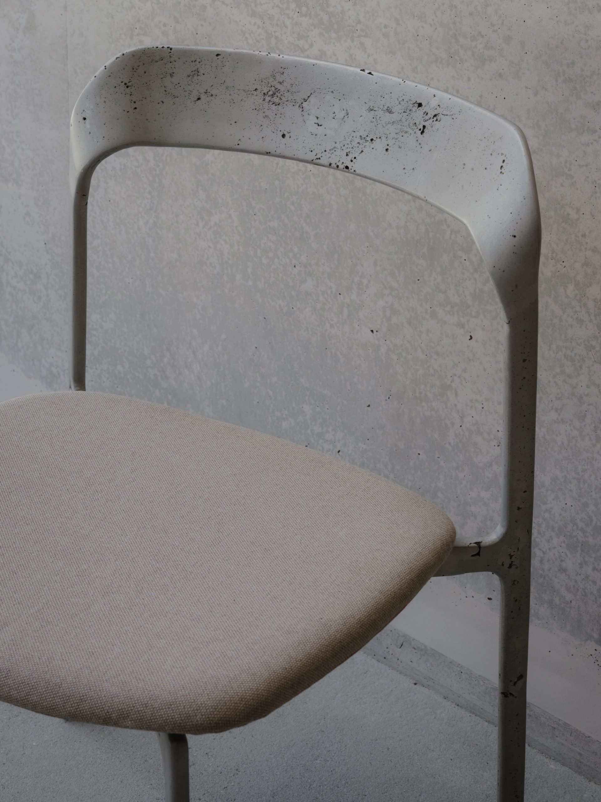
TF: These were not part of the original brief, but when Powerhouse was searching for a chair for the outdoor cafe area that would complement the architecture, I think they were aware of this chair and inquired about it. So we sent a proposal and we ended up making a whole series. They are a sand cast aluminium frame. They have this porosity and variation in them: each one is slightly different in character. They are chairs that work indoors or out, which is often a kind of blurred area in Australia.

SR: How did you achieve that porosity in the metal?

TF: Sand casting is a very traditional way of making, and it’s embracing the imperfections of it. Rather than create this perfect clean thing, we embrace the natural material and show off the process, not hide it. The seat is pressed aluminium and an outdoor canvas. So that means water can drain through it. It's quite comfortable for an outdoor chair, relatively speaking, and it’s suitable indoors.

SR: How does being in Australia feed into your design philosophies?

TF: When I began working there was this huge trend back towards Australian design. I'm sure it's always been there, but it felt like a strong trend of more people wanting to support and promote locally made and designed pieces.

There is an approach to design in Australia that I think is quite special. It's really considered and refined but somehow still quite confident and extroverted. So culturally there's something for me, having lived in Europe as well, I see this as having a little bit more flair. The level of sophistication in the design is very high – I think it's world class.

Design longevity

SR: You have designed for other large institutions too – was it something you set out to do?

TF: It's all kind of organically happened. When I first started developing furniture, I was exhibiting work and collaborating with brands and that enabled me to build a profile and identity. From that, people can then get to understand an aesthetic of what I do.

When we collaborate with brands, they help promote the designers. Or when we collaborate with an architect in a space, they help promote your work and they act as a platform for you to raise people's understanding of you.
I'm always trying to do exhibitions and work to let people understand how I work, because when people think they want to work with you, it's a much easier collaboration.

SR: Your designs for Powerhouse will last generations — there’ll probably be students studying your work at UTS …

TF: Longevity is the key. And public institutions are the perfect places for investment in long term furniture. From my perspective that's a really big part of working with natural material: it has the best longevity and value, and ages elegantly. So my approach is to try to celebrate natural materials and to be more focused about longevity than the inherent work.

The hard thing is trying not to be wasteful. Not to overwork it or negate from material itself. Sometimes that results in pared back designs, because we’re trying to let the material do the talking.

Maybe in the ottoman, there's not a lot of shape of things, it’s about seeing the timber. It’s very different from anything I've done before, and I just love the idea that you're not just seeing a piece of furniture with four legs and a backrest. You're seeing somewhere between furniture and sculpture.